A Leader in Unstructured Financial Data
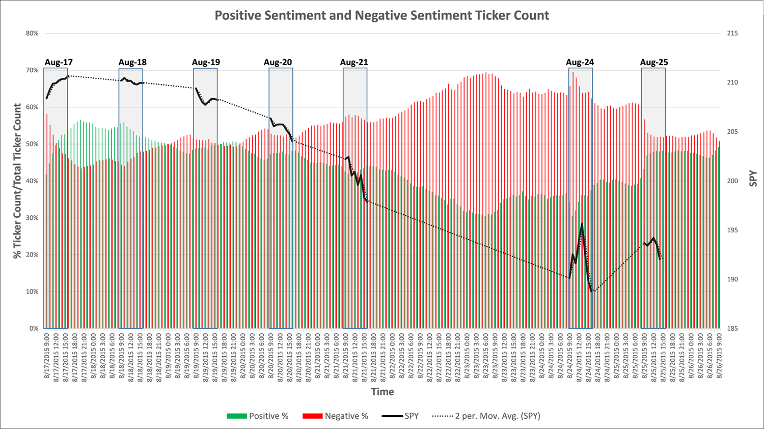
The chart below looks at the percentage of positive Tweets versus the percentage of negative Tweets over the last couple of weeks. There are usually significantly more positive than negative Tweets so the fact that the negative percentage was so high is valuable data in itself. As you can see the percentage of negative Tweets increased prior to days with significant market downtrends.
The black lines on the chart represent market activity. The red and green bars represent negative and positive Tweet percentages. Sentiment is captured by Social Market Analytics 24×7; you can see the growth in negative sentiment prior to the Monday (8/24 draw down). On 8/24 the market started strong and fell significantly at session end.
The universe of Tweets is so large that when you aggregate it you get a terrific view of what people believe is going to happen. This data is only available from Social Market Analytics. Please contact us for more information on our market leading data sets or visit our Research Page.
Thanks,
Joe


Leave a Reply
Want to join the discussion?Feel free to contribute!